Up to your ears in paint colours? Can’t decide which one to use? It need not be tricky, and your starting point is probably right in front of you. Ideally you want to make sure it goes with the furnishings that you already have. A painting or a rug that you love perhaps? Could you paint the room in a shade or hue that would work with both? Not everyone is drawn to bright, bold colours, so be in the moment and think about what colours you are drawn to. You probably already know the colours you naturally love and those that you detest.
Have you been keeping a scrap book of all the interiors you like? Been doing any mood boards? (This is why they are so useful people!) Look through them and magazines and really see what colours are there that you are drawn to. Is there a common colour thing happening? Perhaps you are drawn to old woods, rustic greys or blues. If you love blue, is it midnight, pale aqua, or a Wedgewood Powder Blue? Ask yourself all these questions. If you are seeking paint colours for your kitchen or bathroom, it is wise to pay attention to finishes like the tiles that you cannot/do not want to change. This could also a good starting point for your scheme perhaps?

Pink, apricot, cream and warm woods used with a Cool Light
Pay attention to the orientation of the room that you are painting. Is it North facing? (We are talking Southern Hemisphere) Does it get a lot of afternoon sun? This may be the ideal place to use blues, greens and aquas – cooler colours that will offset the warm sun rays and yellow light entering the room. You only have to think of a sunny, north facing room in February to know that bright orange or red will feel totally overwhelming in there!
Conversely a south facing room has cool, blue light, and no sun, so a warmer shade – yellow, reds, pinks will feel good there. In New Zealand our bathrooms are often on the South side of the house and people paint them blue as they feel this relates to water. Be warned fellow Kiwis, if you paint a bathroom blue, the southern light, coupled with white porcelain and tiles may feel like you are bathing in a chilli bin, not a warm bath! Consider a warm yellow, ochre or cream instead.

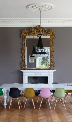
Aqua blue is warmed up here by warm wooden floors.

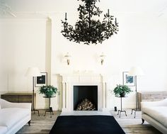
Blue is warmed up with wood tones here- in the curtains, table, and chandelier.
After you’ve sorted out whether you are going warm (reds, yellows, oranges) or cool (blues, greens, aquas) and what furnishings you are going to try to tie your paint colour in with, then get the paint charts out. Not everyone is drawn to bold, clear colours so if you are one of them, then look to the neutral shades of the colour you are thinking of. Always, always, test the colours out. 2 coats, painted on a big sheet of cardboard. And use the exact finish you plan to use — high gloss will look very different from matte or eggshell. If you don’t want to deal with test pots, look for a paint company that offers poster-size paint chips and tape them to your wall instead. Look at them in all lights – morning, noon and night, on rainy days, sunny days, and then at night when you have the lights on. These different lights will all change the paint colour. If a certain shade doesn’t work in the room, and it is in the same colour family that you are considering using, it will probably work in another room in the house. This will give flow and continuity to your space. So, get those overalls on and get started.

Warm terracotta pots and wood tones, help to warm up a neutral, grey, beige. Greige.