Design + Decor Inspiration from LA via Melbourne.

We have just been inspired by listening to the designer seminars at Design + Decor in Melbourne late last week.  Also realised how much we had missed doing posts to help inspire you & that in doing so it inspired us – the best reason of all to post!

Kariwhitmansalvage

Kari Whitman used portholes and a mix of lighting to liven up a kitchen and living space. The portholes allow light to filter in to the space behind the wall. She bought them for $25 from a salvage yard. Clever & Green!

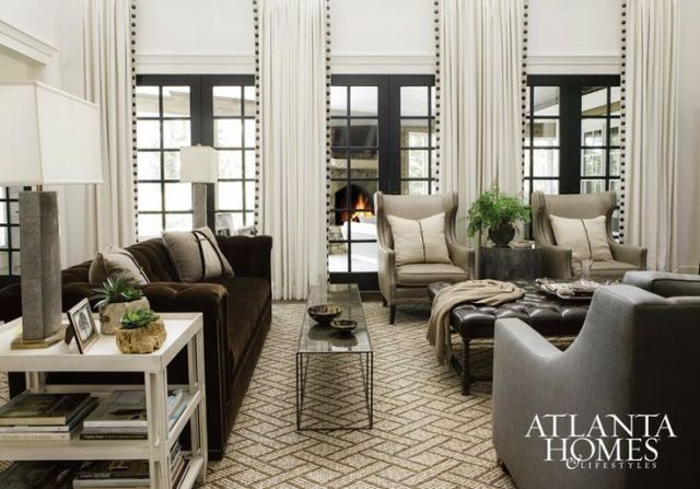
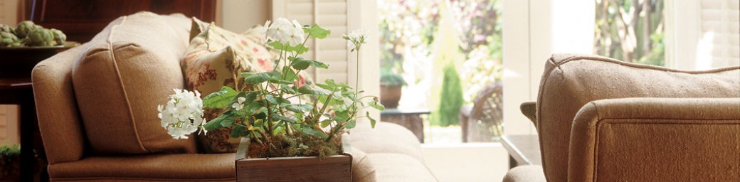
Most of the presentations reinforced the thinking that no house or job for an interior designer is ever the same.  The work of an interior designer should not look the same from client to client, house to house. An interior design should not have a signature style – the style of a house is dictated by the client.  Design should not be a copy cookie-cut that is pasted onto each client’s house.   The job of an interior designer is to help & guide clients to create what they want.  It is a collaboration between the designer, crafts people and client.  It is the mix of old and new and art in a room.

Kariwhitman

Kari Whitman cleverly mixes up vintage furniture with shiny new side table and art.

In the words of Kari Whitman it is about adding ‘Wisdom” to a room, mixing up old and new and also making it pet and eco friendly.  Kari Whitman is an interior designer to the stars in Hollywood and she will search the client’s existing inventory before buying a single piece of furniture. She cleverly mixes older or fun pieces in to create an interesting vibe and wow factor in a room.

kariwhitmanpowderroom

In this powder room by Kari Whitman the vanity has been given vintage knobs & vintage lights were used to add visual contrast to the stunning tiles.

By using and recreating an existing or old piece in a room you are not creating landfill.  The piece should always have good lines and be able to contribute something to the room in terms of scale and style.  It is turning trash into treasure.  By using pet & family friendly materials and fabrics throughout a house people are able to relax and enjoy their space without fear of it being trashed by our four legged friends.  So think about being practical and friendly to our pets and the environment – its another inspiring way of reinventing your space.

KariwhitmanJessicaAlba

Kari Whitman has created a beautiful dining room with a vintage chandelier, interesting art & ceiling & gorgeous colour. Note the spaghetti bolognaise friendly covers on the dining chairs!

If you would like help reinventing some of your furniture please feel free to contact us.

Related links:

http://kariwhitmaninteriors.com/about-kari/

This link below has an interview with Kari at Design + Decor Melbourne, from DesignonLine Blog.

https://wordpress.com/read/blog/id/56182971/

Rooms within a Room

Have you too much space in a living room?  Often spaces can be too big, as big as a barn,and the spaces just don’t seem to be intimate, warm and welcoming. This may seem surprising, but it is as common a problem as too little space and is actually a little more tricky to make work.  Take some interest in the big public spaces around you – hotel lobbies and bistros – to get ideas. Notice how the different spaces work and how they have been linked together to make a cohesive whole.  Is it tied together with colour, similar furniture styles?  Is the flooring different? Note the layouts – you will see each has smaller zones for relaxing, dining, or conversation areas within the greater space.  It still functions as a seamless, personal attractive whole, and your large living room can be similarly zoned.

Furniture arranged in zones keep this room interesting.

Furniture arranged in different areas fill this room & allow for various activities. Held together with similar colours in wall & floor coverings. Via Damask & Dentelle.

To create a spacious feel, unify the room with colour, texture and light, to create harmony within the different areas.  Texture is the best way to add personality and keep things welcoming.  Using the same texture across the different zones and spaces will provide the glue that pulls the whole thing together.

Several seating areas have been created using different pieces.  Again held together with colour and pattern.

Several seating areas have been created using different pieces in this fabulous room. All held together with colour and pattern.

Keep furniture arrangements simple and easy to reconfigure for gatherings in different ways.  Buy more versatile pieces that can be used in different ways. Having a focal point – a large one such as a chimney surround or  a rustic armoire for example will brings warmth, texture and personal interest into a room and will anchor down the different areas/zones.

The fireplace anchors this room as it is the focal point.

The fireplace anchors this room as it is the focal point. Colours are repeated throughout, tying together the different areas.  Interior created by Cindy Rinfret

Get the bigger pieces such as sofas off the wall (have said this before) and then place a desk or even smaller chairs behind a sofa with a table in between  so that you immediately create another area.Thinking creatively about furnishings and re-inventing pieces will make the room even more interesting.

By keeping the chairs and tables simple and not too heavy looking-be sure you can see underneath them as this creates the illusion of space- they can be easily moved around to suit visitor numbers as and when required.

Largeroom2Layout

Note how the colours and tones are similar throughout. Textural interest and lighting help to anchor the scheme as does the contrast in scale and height of the furniture.

Built in seating is a good way to add interest and another zone to a room.

Built in seating is a good way to add interest and another seating zone in a room.

If you would like help with your large room layout please contact us.

Look and follow our Pinterest board for inspiration. (warning Pinterest is highly addictive!)

We also visited Sarsfield Brooke furniture showroom today, with lots of new furniture to get creative with.  Available through Interior Designers nationwide.

Related Links:

Atlanta Homes & Lifestyles Magazine

http://stinemos.blogspot.co.nz/

http://rinfretltd.blogspot.co.nz/

http://www.damasketdentelle.com/en/

Seasonal Change for Autumn

“Delicious autumn! My very soul is wedded to it, and if I were a bird I would fly about the earth seeking the successive autumns.” – George Eliot

Seems like Autumn has started to arrive this week with southerly winds and rain blowing up the country.  It is a little sad that summer maybe on the run, but by keeping things a little warmer on the inside  you will feel nurtured and cocooned.  Bring in a few accessories and welcome being a little more snug and happy about the cooler weather approaching.  A bowl of gourds/pumpkins one way to comment that autumn is here, along with some beautifully coloured autumn leaves – all the colour inspiration you need.

Autumn/harvest colours are warm – reds, burgundies,oranges, rusts and yellows.  Rarely do you see the fresh blues and greens of summer in Autumn.  Add spicy touches of colours to your space with throws, pillows and natural accessories.

growcott-sofa-detail

Change cushion colours to cosy things up

image3b

Re-staging the neutral backdrop you may have in the room with tactile delights helps you to snuggle in. Layer & layer again wool throws, lushly textured pillows, a basket of pine cones, fire wood and a plush area rug.

Inspiring Idea to welcome Autumn

Oh and don’t forget the candles and fireside lamps to help cosy things up even more.  Lamps and candles add another layer of contrast and depth to a room’s lighting scheme and help to create a warm friendly ambience to cuddle down in.  Only thing missing could be the bottle of warm coloured Pinot Noir?!

Related Articles:

http://www.thedesignchaser.com/2014/03/autumn-new-things-moodboard.html

http://justdecorate.wordpress.com/2013/09/18/3-things-you-should-do-to-get-your-home-ready-for-the-next-season/

http://abigailahern.wordpress.com/2013/10/02/fall-decorating/

Dulux Colour Forecast 2014- Future Tribes

Dulux have predicted the latest international trends from around the world for 2014, which denotes travelling the world without leaving home as in being a digital nomad.  Be inspired by cultures that place emphasis on energetic colour and vibrant pattern.  Imagine being immersed in the life of an Aztec tribe or feeling the energy of a Moroccan market place.  (Personally, it would be better to feel the real thing rather than digitally through the click of a mouse don’t you think?)

Anyway, will try to explain what they are getting at – sometimes the language gets a little flowery and designery for some of us more humble earthlings.  There are 4 sections/tribes of colour which are named as below.  Rejoice- it is a return to colour and pattern big time!  Pretty sharp colour along with lots of soft pastel almond colours including flesh pinks, rusty browns, in the  aquas thrown in with some really vibrant fluoro colours too.  All of these can be placed in amongst our more neutral greys, creams, whites, browns and blacks to spice things up a little and add much needed punches of colour.

1. The Digital Nomads Palette Think Aztec prints colours and vibrancy.  Digital patterns, Geometric shapes too.  Colours are bright with smokey amethysts and metallics coming in too. Overall feel is sharp, and contemporary with an edge of softness.

http://www.dulux.com.au/specifier/colour/colour-forecast-2014/specifier-trends-digital-nomads

Duluxdigitalnomad

2. The Retro Visionaries Palette  Here you can see energetic forward thinking with bright colours, some almost fluoro (interior colours always follow fashion), so bright yellows, cerise pinks, azure blues, mixed in with bright turquoise.  These also have a slightly retro feel to them too.  A little of this in an interior will go a long way and the trick is to pick one or two colours and play with them in different ways in each room.  Don’t try to have the whole lot in one house, otherwise it will feel like living in a kaleidoscope of colour.  Overwhelming.

Dulux3

http://www.dulux.com.au/specifier/colour/colour-forecast-2014/specifier-trends-retro-visionaries

DuluxFutureBright

3. The Precious Elementals Palette  This has a more masculine vibe with strong, earthy umbers, browns, and rusts mixed in with greys and soft natural woods.  This represents our awareness of what we are doing to our earth as we live here.  There is a softness about this new contemporary look, gone is the tough steel, industrial look of chrome.  Organic in feel, it has used quiet, muted, neutral colours, with nothing rustic or worn.  This palette is infinitely useable anywhere in the home and will be easy to incorporate into existing themes.  Perfect!

Dulux-Precious-Elementals-2014-04

http://www.dulux.com.au/specifier/colour/colour-forecast-2014/specifier-trends-precious-elementals

Dulux

4. The Romantic Spirits Palette  This has a softness and romantic warmth about this palette.  The colours show a fresh look at our heritage.  The pink/flesh may be a little feminine for some, but if you mix in with contemporary charcoal geometrics it becomes hip and vibrant.  There is a nostalgic nod to our past, which lets us incorporate these older pieces into our digital age- the return of turned legs for example.  Touches here and there are all that is required, and when mixed in with rusty browns it gives it a strong edge that is not frilly.  There is a rustic feel to this palette too as soft patinas and worn woods sit happily alongside the moody colour.  (This is my personal favourite as can be seen by the “I love Pink” pinterest board)

Dulux-Romantic-Spirits-Dulux-Colour-Forecast-2014-04

http://www.dulux.com.au/specifier/colour/colour-forecast-2014/specifier-trends-romantic-spirit

DuluxRomantic

Well there you have it.  Click on the links above to find the Dulux Paint Colour suggestions.  Am pleased to say have been using Lyttleton, Opito Bay, Ohai, Franz Josef in interior design colour schemes lately.  So far no one has gone for the pink, but am slowly adding it around the all male Hutton House.  Do you think they’ll notice? Which one is your favourite?  Can you think of ways to update your existing colours schemes to incorporate these new colours?  If you would like help with this, we’d love to hear from you.

Related links:

http://www.dulux.com.au/specifier/colour/colour-forecast-2014

http://www.yellowtrace.com.au/2013/09/03/dulux-colour-forecast-2014/

Go for Gold – new trend

A trend we have been noticing recently is the use of Gold in interior design.  After many years of chrome and stainless fittings there is a return to brass and gold.  It is probably because the neutral colour of the moment is Grey, which can seem a little cold and unwelcoming so a Glint of Gold just warms things up.  It also looks fabulous with a classic black and white colour scheme, adding a bit of vibe. There is no need to go around changing all the hardware in your home to gold or brass, but just introduce a few touches here and there to get going.  Here are some images from  to explain what we mean:-

The above gold Etch Pendants are designed by Tom Dixon.  Look so dramatic against the Black background.

The Gold mosaic wall tiles add a touch of glitz and glamour to an otherwise industrial-styled Cafe.  Love the textural play with the sheepskin rug on the stools too.

Above you can see the use of a gold metallic table adds warmth to this grey scheme and works really well with the green chairs (which also have gold upholstery nails). And finally the kitchen below, courtesy of Greige Design, shows how beautiful brass handles look amazing on Grey cabinetry in a classically styled kitchen.

So Go for Gold and add those Gorgeous Glints to your rooms. If you would like help adding a touch of gold to your interior design scheme, contact us.

Related Articles:

http://leitmotiv-interiorismo.blogspot.co.nz/search?updated-max=2013-10-22T09:39:00%2B02:00&max-results=1&start=6&by-date=false

How to create the Perfectly Imperfect Room

Having talked about letting go of perfection last week, we thought we better help you create interiors that are not so perfect.  For many of you, creating the perfectly imperfect room will be scary but it is not as hard as it sounds. The main in creating an imperfect room is to try to achieve welcoming, cosy, relaxing and comfortable feeling.  To simplify the process we have made a list: (this is a perfectionist thing to do- I know!

  1. The easiest and most important thing to do is to colour your room in.  Yes, paint those walls a warm welcoming deeper colour and it will instantly transform your space.  White/off white doesn’t do that.  Colour is the easiest, least expensive, most transforming, old decorator’s trick in the book.  Go for a soft neutral like Dulux Waitangi, North Head, or Opononi. Be brave and make it double strength.
  2. Move the furniture off the walls.  Get the big pieces – sofas and chairs in an arrangement as if they are “talking” to each other.  It looks so welcoming.  Add the big and squishy, comfy too. (layers again).  Next place the side tables there with the lamps/candles as that is where you comfortably want to place your G&T tonight isn’t it it?

  3. Add texture, texture, texture, layers of it.  Create an element of rough with smooth.  Fluffy with shiny.  Everything all shiny and smooth, is cold and unwelcoming. Frigid. So add rough loved furniture, the shaggy rug, hand knitted throw, the wicker basket.  This creates a tension and vibrancy in a room which moves it into an interesting space, far away from bland land.
  4. Add layers, layers, layers, of texture yes, but also the quirky, interesting, and underlying. Add the rug, add the cushion, add the wallpaper, add the pattern, create some tables-capes, make the mantle piece look magic.  This all creates layers of interest in a room. Yes, you will have to dust a little, but at least it will be interesting.
  5. Add some lighting. Get those lamps plugged in, candles lit, and put them in corners and on tables.  As many as you like. They add interesting pools of light to a room, are beautifully soft, warm and  welcoming and of course less than perfect. Overhead ceiling pot lights, perfectly placed in the 4 corners of the room just don’t do this. They are stark, unwelcoming, uninteresting and predictable.
  6. Next you need to add something less than perfect- a little bit of wacky, quirky, odd ball, unpredictable and funny.  Even a stuffed animal will do. When everything is too perfect it lacks humour and therefore is uptight and perfect.
Image

Table Scapes create focal points

TextureandHumour

Texture with Humour

Now you can sit comfortably in your re aligned space and enjoy with your family and friends. What could be more perfect than that?

Keep Calm on the Inside

Finding Calm in an increasingly hectic world has become a challenge.  With the constant invasion of technology, life carries on at a frantic pace.  Life is so often the ‘full noise’ and turned up so loud it is not a surprise that many of us will seek sanctuary in a soft neutral colour scheme.  We are bombarded all day long so why would we want to come home to a colour calamity that screams ‘full on’?

f61d97f0225e66a8af17581f9f48a96f

We want colours that are calm, soothing, soft and subtle like in the above photo, courtesy of Woonmagazine. This can be anything from Greyed off whites, a whole range of creams and an infinite variety of oatmeals, greys, taupes and browns.  These colours are borrowed from nature, so think about our sandy beaches, silver fish grey skies, weathered grey woods and foliage such as Manuka, Corokia and Astelia plants. Cliff faces, pumice and rocks can also provide colour inspiration – nature has so much to offer to a colour scheme doesn’t it?

To be calm you will need to be ‘cocooned’ so think about darker, smudgy colours. (I’m not thinking Black and White here – too cliché and overused).  Darker colours will come toward you and are somehow a lot more nurturing than stark whites and hard blacks.  B & W are too ‘edgey’ and uninteresting to impart calm in your life. Try out Moody Mellow colours that are softened off.  A good example is the photo above – love that picture window and how it brings the outdoors in along with a textural play.  The muddied-off-pinks and mushroom-browns below are another great example how a naturally neutral interior can be calm and welcoming at the same time.

It is also wise to remember when doing a calm, soft scheme that is important for you to layer with textural touches too.  Place rough with smooth, shiny with matte. (The first photo is a good example of this) Texture is so often overlooked in a calm, tranquil interior scheme and is the most important layer to add the depth, character and soul to your interior. Below, not a lot of colour is used, but touching use of texture makes for an interesting play on grey.

Again let nature be your inspiration.  Anything left outside will weather off in the wind, sun, rain and salt air to a perfect neutral – cedar, zinc, driftwood. When adding texture  think rough logs, with smooth velvets, shells, plants and sisal matting; Soft mohair and linens too.  Below are more examples of how to work with calm colours in your bedroom and home office. What you will also find working within  limited colour palettes such as these, is that they will create continuity and flow to your home and therefore the illusion of space.  All good things don’t you think?  So, Bring the outdoor colours inside, to Keep Calm on the Inside.

166018610708f46fae78e14f15f28926adf1c569e7b083241067f052907f0482

If you would like help creating a soothing, calm colour scheme for your home we’d love to hear from you.

Related Articles:

The above inspiring photos are from Woonmagazine.

https://roomserviceinteriors.wordpress.com/2013/06/27/the-missing-link/

https://roomserviceinteriors.wordpress.com/2013/07/18/neutral-colour-schemes/

Re-Style to give your Furniture New-Style

Reinventing or restyling a piece of furniture is a great way to inexpensively get a whole new look.The photo below shows how a humble cupboard, in a style we often see here in New Zealand, can be re invented by putting some funky fun colours, and more modern accessories around it.  Most of us would be inclined to paint the cupboard or change it somehow, but here it is shown that there is no need.  Just add a modern/retro touch with the cool colours and it seems quite at home.

And here is another idea for a dining area.  Repaint the chairs and place with a retro/modern styled table. Easily done to reinvent those old chairs that you might be tempted to give away!

RepaintedFurnitureBelow is a chair reupholstered in a funky pink, and yet it works with all the more up to date things around it.  Nothing expensive or trendy here, just great styling.

Below is an update on another chair- having a de-constructed look is quite a trend at the moment as is adding an industrial edge to more traditional pieces.

The Boiler Room does a fabulous job or reinventing some of our more colonial heritage pieces.  Gary and Sue have a great talent for finding the ordinary and reinventing it in a whole new way whether it be industrial or contemporary.  Very clever and talented.  Check out their website and visit their shop in New North Road.

Perhaps in our consumer, fast moving society we all just need to stop, take a breath, and think about how we can re invent a piece of Nana’s furniture so that it becomes an item of beauty.  Up-cycling, no more landfill required. What do you think?

Check out our Pinterest board for more inspirational furniture re-invention ideas.

Related Links and Further Reading:

http://leitmotiv-interiorismo.blogspot.co.nz/2013/09/buscando-el-desenfado.html

http://www.boiler-room.co.nz/blog.htm

Hallway to Heaven

When walking up your hallway does it take you to heaven?  Are you going ‘Wow, this is interesting’ or do you just pass on through and not stop because it is somewhat lacking? Well then! Stamp your mark here in the hallway, and give it some of your personality.  Start by getting rid of the detritus that everyone dumps there when they come in the door.  You know that is always the starting point of any project don’t you? Add a basket for those track shoes, and an umbrella stand. Wall hooks?

RivaHotelviaFlicker

RivaHotelviaFlicker

Then begin adding those layers we have talked about before- hang the art or a rogues gallery, add a  runner, or rug, paint it an awesome colour, add mirrors, and maybe even a feature wall with wallpaper. The more carefully chosen layers you add the more captivating a space will become.

(See previous blogs: https://roomserviceinteriors.wordpress.com/2013/06/10/less-is-a-bore-let-the-room-evolve/ )

SimpsonEntrance2

In your hallway,  push the boundaries colour wise and take it from being the dullest to grandest room in the house.  Make sure though that it links back to a colour that you have used elsewhere so you keep the flow and continuity going through the house.  If you have a long, long, long hallway a good colour trick is to paint the end wall in a dark/bright colour as it will seemingly shorten the length of the hallway.  (This is because dark/bright colours will come towards you.)  Using colour is particularly effective if the place is dark with no natural light.  On a job we are working on my client added dark wallpaper up the stairwell in her house and it looks awesome.   It has taken the space to a whole new level, picks up the lead light windows too and at night the gold just shimmers.  (I give her all credit for this as she had bought it before I came on board!)  We are looking forward to the vintage chandelier going in on Thursday, which is my next point:-  Add an out of the ordinary light fitting too.

RoomServiceWallpaper

Next you can add a skinny console, or cabinet.  Place flowers, or maybe even a lamp there, candles, add some art work &/or mirror like in the picture below and you’ll have done a great job!

HallwayParkAve47

via 47ParkAvenueblogspot

Have a look at the inspiring ideas and home office spaces on our Pinterest board.  If you would like help creating a hallway to heaven for yourself click here to contact us .

For more ideas and inspiration have a look at these Related Articles:

http://47parkav.blogspot.co.nz/search/label/hall

http://abigailahern.wordpress.com/?s=hallway&submit=Search

http://47parkav.blogspot.co.nz/search/label/black%20painted%20staircase

Kid’s Zones at Home

If you talk to your kids about redecorating the rumpus or their own rooms, you will in all likelihood be told “You are so last century, Mum”  Tech-savy kids these days want a Media Room, yes, ca-ching$, ca-ching$, but it will grow with them and they will use it for a number of years.  Be warned though: all their friends will want to be at your place so there will be noise, smells and mess.  However, it is better they are home at yours than being goodness knows where isn’t it?

So, they will want a computer, big-screen television, and games console.  Maybe even a tennis table or a pool table if you have room.  They require something to layabout on, because that is what they do.  The space needs to be bullet proof and practical.  It’s also room to do schoolwork, play games, rough-house, read, daydream, visit with friends and stockpile toys.  You can make it themed as well, but you will need to have the preceding items in there first! ( You can get them to work off their half of the cost and your half could be a combined Christmas or Birthday present for each item.)  For security reasons try to make it a shared space like a rumpus or home office- so the computer is there and not tucked away in their bedrooms.  The shared space is a good place for the TV too as  kids need technology ‘downtime’ these days, and the bedroom should remain just that.  Clever storage is also a must also you can stash away consoles and games when the big kids (parents) actually get to use the space. Baskets and draws on wheels and castors can be popped away in cupboards.  All the above is also useful to remember for their bedrooms as well.

Themes?  Well, you can create themes around where you have travelled – it is a good to use all that memorabilia and can make for a fun space.  Or perhaps junior is interested in cricket, rugby or music.  So create a “Room of Fame” and put framed prints of their favourite heroes up on the walls.  The owner of this bedroom below was a young man you adored cricket so we had some cricket nets made as bed ends and a storage unit to make him feel like he was always at batting practice.  (He is still playing at 21 years, so I guess it worked!)

Angela's Clients 0063Don’t spend too much money on the shared space or bedrooms as they simply do not care, but let your imagination go, and have something cool.  Paint it in an amazing colour or let the accessories do the work.  Do not get too hung up about it going with the rest of the house as you will have to shut the door when visitors come anyway – because the “floordrobe” is put to better use than the wardrobe!  They also grow up and grow out of themes really quickly.

33660_2

33660_3


This bedroom was done inexpensively with duvets, flags, and bunting around the edge of it.  The boat in the corner was found on the beach and dragged home. The lifebuoy was also found on a wharf, and inexpensive pictures all carried on the theme.  Chains, ropes and anchors where bought at the local DIY store.  Not too much expense, just time and imagination required.  We then made the theme a little more grown up by repainting a very dark moody adolescent blue.  A bit more man cave. Still used the same accessories and storage, but changed the duvet covers and got rid of the flags. The kids have left now, but the cat is still here!  

yh0305p025Hutton9-1_webyh0305p025Hutton9-4_web

The other room had an African Explorer theme which stood the test of time and used up Egyptian art, African artefacts mixed in with a zebra print on bed cushions and antique desk and chair.  Here at the Hutton House they have become adult rooms now, complete with Queen sized beds and we are working on getting rid of the accumulated clutter of 20 years.  (Yes the timer is set on Wednesdays for one hour if you want to join in!) We are aspiring for a rumpus space that looks more like the one below…..

MediaRumpusRoom

Via Barbara Fiorito
http://pinterest.com/bcmf/

For more ideas and inspiration have a look at these Related Articles:

http://houseofbliss.blogspot.co.nz/search?q=kids+rooms

http://nordicdesign.ca/blog/lovely-kids-room-inspiration/#.UhLXbpJmhw8